

There is a strong interdependence between the quality of your e-commerce website's UX and its success on the market. While this has become common knowledge among online store owners over the last decade, there is one facet of the shopping experience that still seems to hinder sales – mobile.
A subpar m-commerce experience poses a threat to a business's profits by dissuading users from purchases due to unnecessary friction and poor optimisation.
This seems to be especially problematic, considering that the global m-commerce sales are projected to reach USD 3,5 trillion in 2021 and represent around 73% of the e-commerce market.
This article will explore a variety of user-centric solutions that will help stores improve their overall UX and, as a result, significantly increase their conversion rates.
Let's dive right in.
What is the value of UX design?
Fundamentally, user-centric products and services leverage their understanding of their customers to help them achieve the desired transformation. Whether it's self-improvement, entertainment, or asset management, people can achieve their goals quickly and efficiently. As a result, UX-focused companies perform better financially.
This applies to e-Commerce businesses too. Ten years ago, online stores were predominantly focused on creating eye-pleasing designs, while their usability lagged behind. Today, much more thought is put into information architecture, intuitive navigation, and user research than ever before.
Undoubtedly, the overwhelming adoption of user experience principles has provided us with better and smoother online shopping. Making purchases on the web has never been as casual and straightforward. Sadly, it's not always the case for mobile e-commerce.
The state of UX in m-commerce
M-commerce has seen steady improvement in UX over the last decade. According to a 2017 study done by the Nielsen Norman Group, e-commerce sites had 111% more sales performed on desktop than mobile. Despite this high discrepancy, it's safe to say that it's a substantial improvement compared to 2014 data, where this difference was at 288%.
The magnitude of the problems associated with the m-Commerce experience is also underlined by a study conducted by the Baymard Institute. After analysing over 20,000 hours of mobile user behaviour on the world's 58 biggest e-Commerce platforms, they've identified over 3,600 usability issues. These issues span from navigation and address validation to autocompletion and beyond.
 Image credit: Baymard
As a result of this analysis, none of the 58 e-Commerce platforms scored "Good" or "Decent," most of them being placed in the "Mediocre" or "Acceptable" categories. This low performance is a clear indicator of the grand scheme of things in m-Commerce.
Fortunately, there is a wide array of actionable recommendations that e-Commerce platforms can consider to quickly and efficiently improve their mobile UX.
Improving m-commerce with UX
Implementing a good user experience demands a lot of work and testing, especially in online stores due to their size and customer diversity. Below, we'll provide you with some essential recommendations to address today's most pressing m-commerce UX problems.
Double-down on personalisation
Personalising e-Commerce experiences isn't just one thing — it's a strategy. Adopting a tailored approach to your customers' needs is a surefire way to improve your conversions and boost user satisfaction significantly.
There's a wide array of studies that underline this strategy's importance and the benefits it reaps. Here are a few examples:
- A study conducted by Epsilon indicates that 80% of customers are more inclined to make purchases from businesses that offer personalised experiences;
- A report published by Segment suggests that nearly 45% of customers say that they're inclined to make repeated purchases from businesses that offer personalised experiences.
- A study published by Forrester found that 77% of customers have chosen or recommended brands that offer personalised experiences. Some have even consciously paid more for their products or services;

Ensure frictionless search experience
Allowing users to quickly and comfortably find what they are looking for is one of the fundamental things e-commerce businesses should ensure. M-commerce is a challenging field in this regard due to the mobile experience itself because there is limited screen estate where products can be presented. Poor search often leads to irrelevant results being shown first, and there is only a certain amount of items users will scroll through before they abandon their search to go look somewhere else. This not only causes unnecessary frustration for potential customers and dissuades them from making a purchase, but might also prevent them from returning and thereby make the e-tailer miss out on future sales.
Yet, providing relevant results still poses a big challenge for e-commerce stores. Even if many search solutions can handle spelling mistakes from clumsy thumbs on tiny keyboards and allow you to set up common synonyms, relevance is highly personal. Two users searching for the same keyword might mean completely different things. Loop54 uses general popularity as a starting point for sorting search results. In addition, the algorithm analyses the customer's behaviour to determine in-session intent and unique customer preferences. Session intent examines the type of product the customer is looking for during the current visit, whereas unique preferences don't change between sessions and also help customise results during future visits.
However, even the best search algorithm cannot increase conversions if the customer doesn’t use it. It is therefore advisable to prominently position the search bar in the store layout. Especially mobile users are looking for fast results and can quickly lose interest if they have to look for the search function hidden in navigation.
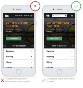 Image credit: thinkwithgoogle
Focus on scannability and navigation
Users typically favour interfaces that they can scan and navigate quickly, especially on a small device. To ensure that, it's imperative to declutter your m-commerce webpage to minimise friction and cognitive overload. Try to keep the number of navigation levels to a minimum and give your users visual clues where they currently are in the navigational structure. This will allow potential customers to feel more confident they are looking in the right place and find the desired products quicker without feeling overwhelmed.
Users who browse through product pages via category navigation tend to be in a more explorative mood than users who use the search function to look for something specific. They typically want to familiarise themselves with their options and identify products and categories that potentially interest them. Even if they don't make a purchase straight away, they will generally make a mental note of the assortment and certain products' availability in a store, motivating them to eventually return and make a purchase. Therefore personalization and relevance also play an important role in category navigation.
Loop54’s category navigation feature provides the same possibility as the search function to sort results according to an individual customers’ needs. This removes unnecessary clutter from the user's interaction with your store, highlighting relevant products that they are most likely to buy based on their interest.
Be thoughtful about trust and quick checkouts
The sense of safety that a product creates is rooted in its design and copy. Let's try to think about making a purchase from a user's perspective — but let's not picture them as consumers, but rather as people who choose to share their financial and personal data with you.
Here are a few ways to minimize the hassle of filling out data on a mobile device and mitigate the anxiety related to sharing such sensitive data:
- Never hesitate to remind your users about the safety protocols your store uses to ensure that their credit card information will be safe and secure. Display safety-related badges and seals to quickly convey what safety measures you are taking;
- Create a seamless checkout process to decrease cart abandonment rates, which might diminish your profits. Invest extra time to continuously test and improve existing checkout flows that will help users feel comfortable about providing you with their data;
- Reduce the amount of typing users need to do during checkouts. Shoppers aren't particularly fond of entering their credit card information on mobile since it can be time-consuming and potentially risky in public settings. Providing your users with swift checkout options via PayPal, Google Pay, or Apple Pay will allow you to reduce friction during this crucial point and help you boost your mobile e-Commerce conversion rates;
- Abandon mandatory registration. According to the Baymard study we mentioned previously, 35% of users are dissuaded from checking out due to mandatory user registration.
Re-think autocorrection
It's commonly recommended that e-Commerce platforms disable their autocorrection dictionaries if they don't work very well. Improper autocorrection can be very frustrating when noticed by the user and very problematic when not, especially when it comes to addresses and other essential data.
One way of preventing this from happening is having this feature enabled selectively — predominantly for types of data that are not prone to such errors. This won't only ensure higher conversions but also prevent user frustration and misdelivered orders.
The bottom line
When it comes to mobile UX design, we've gone quite a way from unoptimised and unresponsive interfaces. However, users still face various challenges when shopping online, a lot of which can be easily addressed.
For more tips for improving the mobile user experience in your e-commerce store, download our mobile site search and navigation design guide.

Topics:

