If you run an eCommerce website, always make sure your product listing pages have the right attributes. Many of your customers will go to your product listings to find out if your site has the product they're looking for.
If you don't provide this, you’ll see an unnecessary drop off before users even reach the actual products.
The best product listing pages allow visitors to seamlessly find the products they want and disregard the ones they don't. This might involve filtering, sorting, and comparing products. But to create a user-friendly product listing page, first you need to work out the most important product attributes.
Obviously, it would be very hard to give you clear-cut guidelines on exactly what you should include. It all depends on your industry, audience, and product range. But there are some key features that most eCommerce websites should use.
6 vital factors to highlight in product listing pages
1. Price
Most site owners know that price is perhaps the single most important attribute to show in the product listing. You'd be hard pressed to find an eCommerce website without price information, at least when it comes to B2C.
Make sure the price is highlighted in the listings. If any products are discounted, show that clearly by striking through the old price and highlighting the new one. And if you can’t provide pricing information for some reason, make sure you explain why.
2. Images
In some industries where visitors choose products based on visual appeal, like fashion and home decoration, images are nearly as important as price. But getting imagery right is important for almost every industry.
The best product listing pages use unique images and thumbnails for every product. If a couple of images are missing, people will instinctively feel that the presentation is incomplete, or that the items aren't available, and you’ll probably see a lower click-through-rate as a result.
https://www.loop54.com/blog/how-to-build-user-friendly-product-listings3. Product title
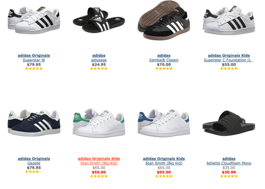
Sometimes a product name accurately describes what the product does - or carries enough brand weight to the point where a description isn't needed. In the example below, Zappos.com has listed their Adidas shoes by their brand names, which makes sense since visitors will be familiar with Stan Smith, Gazelle, Samba and other legendary Adidas models.

However, in other cases the product name alone might not give enough information. Let’s look at three adapters from Amazon.com as an example.

Looking at the first title, it’s impossible to understand what the product does – it’s just a TOWABO. B072QL1WKC (?). The title of the third product, however, is far more descriptive and instantly tells us what the product is for. If your visitors care more about the function than the name, use a more descriptive title.
4. Key features
For certain categories, there will be some key features that people use to find and compare products more than others. You should present these features right in the category listing so that users can identify (and disregard) products without having to click on them.
The features you present on your product listing page will depend on your product range. The key is to go through all categories on the site and select a couple of features for each listing that are vital when choosing products. For furniture, it could be material and dimension; for TVs it could be display size and resolution; for wine it could be grape and producer, and so on.
Again, this is to make it easier for users to find suitable products right on the category page.
5. Don’t overdo it!
It's equally important to not overload your products with information. If you add too much, the listing gets cluttered and it becomes hard to navigate the page. If you've included the thumbnail, product name, two or three key features, and the price, you probably have enough information.
6. Personalisation
You can make it easier for customers to find and compare the products they want by using personalisation to show them the most relevant results.
Use in-session intent to sort category listings in real-time based on the area of your catalogue that they're browsing. You can also rank listings based on their personal preferences, such as brand, gender, and size. By using both in-session intent and customer preferences, you can deliver a truly personalised browsing experience.
Once you've got your product listings in place, the next step is to think about filtering options for each category. This will make it even easier for users to narrow down their options.
But before you get started on that, make sure you read our 13 tips for designing and filtering facets.
Topics:


