<img height="1" width="1" style="display:none" src="https://q.quora.com/_/ad/ad9bc6b5b2de42fb9d7cd993ebb80066/pixel?tag=ViewContent&amp;noscript=1">

User Experience Guide

Site search & navigation design

Download the PDF Version

user-experience-guide-hero

Introduction

We know that a well-designed e-commerce website can attract and retain customers. That’s why we’ve spent years helping our customers optimise their search and navigation experience.

While we focus on providing the most relevant search results and category listings via our API, our retail clients must decide how those results and lists are presented to the user.

We believe that a great search and navigation experience requires both relevancy and design. Therefore, based on our own and other’s research, we have compiled a short list of the best tips for designing a frictionless search and navigation experience.

category-structure-1

Category structure

Categories are part of the product catalogue hierarchy and should describe the product. It should give an idea of what the product actually is. Unlike filters - which can be the same across categories - categories are mutually exclusive and will generally trigger a new page.

Categories vs. filters

Do not confuse filterable product attributes or product “states” (e.g. What’s New, Bestsellers, Sale, Gifts, Just Arrived, Brands) with categories. Categories are mutually exclusive, filters are not.

Product types (those without unique attributes) should be used as filters - not categories.

You can link to pre-filtered lists from the top level menu (i.e making it seem like a category to the user), but do not actually make these attributes categories in your data structure. Doing so will severely deteriorate your search and recommendation engines.

General rule of thumb: if there are less than 30 items in the category, consider using it as a filter instead.

categories-vs-filters

subcategorisation-1

Subcategorisation

When creating subcategories, try to stay under 10 per category in order to not overwhelm the user. Aim to have at least 10 products in the deepest category level.

accessories-1

Accessories

Have a dedicated “accessories” subcategory within the relevant high-level categories. It can be confusing to a user to have a general accessories category which holds all accessories. Instead, having accessories that match the theme of that parent category makes more sense.

mirror-subcategories-1

Mirror subcategories

If necessary, place subcategories in multiple main categories. There are two ways to do this: either place the subcategory in one place and link to that destination in each location or, more technically difficult, duplicate the categories in the website’s hierarchy.

CAPTCHA

Autocomplete design

The value and impact of the user search experience lies in the way that autocomplete suggestions can assist and guide users to better search queries. Poor autocomplete suggestions can often lead the user on a detour, destroy the experience or force the user to completely abandon their search. Here are a few tips on how to improve the search experience with better autocomplete.

diffentiate-the-widget

Differentiate the widget

Add a subtle border or shadow to create page depth. This makes it easier for the user to focus on results.

Include-search-history

Include search history or top searches

Consider indicating previous search history through a distinct style. This creates value for the user. If the user has never searched before a “Top Searches” can be used instead.

scroll-arrows

Scroll with arrows and select with ‘enter’

Allow users to navigate the list with the arrows keys and choose a suggestion with ‘enter’ key.

Avoid scrollbar

Rather than having a scrollbar in the autocomplete widget, ensure that it simply expands to show all potential suggestions, creating a better and easier-to-navigate experience for the user.

avoid-scrollbar-1

Limit suggestions

Do not show more than 10 rows of suggestions on desktop version, and no more than 4-8 on mobile. The autocomplete suggestions should be requested for every key press after 2 letters are typed, with a keypress delay of about 50-150ms to avoid flickering when the user is typing longer queries.

limit-suggestions-1

Highlight the differences

Rather than highlighting what the user has already input, consider highlighting the differences in the search.

highlight-differences

Never replace query suggestions with results

Autocomplete results are specific product suggestions that lead directly to a product page. Autocomplete query suggestions lead to a normal search results page. Autocomplete results can compliment, but never replace autocomplete query suggestions.

query-suggestions

Include scope

Scopes allow the user to narrow their search options while searching. Think of scopes as the aisles of a store.

  • Consider highlighting scope with a unique colour
  • Include “In” so it is obvious that it’s about scope and not within the query suggestion.
filters-and-facets-1

Filters and facets

Filters use certain product metadata as visible criteria visitors can use to refine their search queries. Faceted filters take it one step further and allow users to narrow results by several different dimensions simultaneously.

  1. If there are more than 20 results, use faceted filters to help narrow product choice.
  2. When appropriate, use both sorting and filtering options.
  3. Don’t get fancy - use differentiating product attributes as facets. Often the attributes to use are:
    1. Obvious site-wide attributes like price, brand, category, product variations and user ratings
    2. Attributes that accurately evaluate which of the products in the list are of relevance
    3. Attributes that enable the visitor to compare relevant products to one anothe
    4. Attributes that can be consistently included and presented across products in the same list
  4. Ensure products are listed in appropriate categories.
  5. Display the most commonly used product attributes first.
  6. Allow users to clear previous selections and start over.
  7. Allow users to refine results by selecting more than one category.
  8. Allow users to select criteria across more than one category.
  9. Should there be a large number of options available, put the 2-5 most common ones and hide the remaining behind a “view all” link.
  10. Should there be a need, allow categories to be refined further by presenting new facets that only apply to the selected category (i.e. dynamic faceting).
  11. List the number of products available with each attribute.
  12. Make it clear to the user what attributes they’ve already chosen with a persistent selector.
  13. As filters are applied, remove filters that have zero matches, except for the scope in which they made their selection. Retaining the filter and the previous count of products within that filter allows the user to work their wayback easily.
product-list-layout

Product list layout

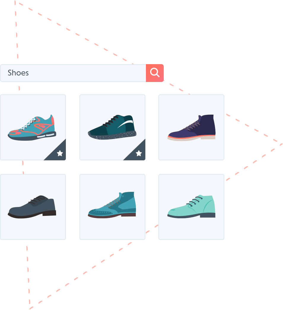
Designing search result list items is a balancing act of including the necessary product attributes that the vast majority of users will need, without overloading the list with so much information that users get discouraged from exploring. At a minimum, common attributes like price, variants, ratings, title, price and image should be included in the thumbnail.

Possible category-specific attributes to include in the product list scopes

  • Compatibility information
  • Dimensions
  • Appropriateness (e.g. age or occasion)
  • Etc.

*Rule: use attributes that can be consistently included and presented across all products in the same list.

  1. Always have thumbnails for all list items. No thumbnails can confuse users as they may perceive the item to be unavailable.
  2. If accessories are shown in thumbnail, make it very clear what’s included in the list item price otherwise users will assume everything in the image is included.
  3. Indicate product type in the list item thumbnail
  4. Thumbnail should dynamically change to display the relevant variant - as per the user’s search query.
    dynamic-thumbnail
  5. Consider having both ‘use context’ and ‘cut out’ thumbnails available. Use the same type for all products in the list view, otherwise the user can not easily compare items
    chair
  6. The size of the thumbnail should be reflective of the importance of seeing detail in the item. Use grid view with fewer columns if details need to be seen clearly.
  7. List important product information in the list item thumbnail.
  8. Be aware of only showing products in packaging. It can be helpful if packaging is more recognisable than the product itself. Consider ‘unpacking’ the item and displaying it next to its packaging.
  9. Aesthetically identical products should use the same thumbnail, otherwise users will try to compare them visually.
  10. If your site’s product catalog is a mix of both visually and spec-driven products, you will need to design two different search result layouts (grid and list view). The layout of search results, if not matched properly with the product type, may limit the user.
    grid-and-list-view
  11. Synchronise and group all elements which lead to the same path. This will help users understand where the interactive element will lead them.
  12. Consider separating elements by their path and functionality so that related paths and features are grouped together. For example:
    1. product thumbnail and title follow immediately after each other as they both link to the product page
    2. then have elements with other functionality, such as an ‘Add to Cart’ button or the ‘favourite’ heart appear elsewhere.
    favourite
  13. Use the thumbnail for the primary path only: the product page. ‘Quick Look’ button – if used – should not be placed in the middle of the list item thumbnail.
  14. Use ‘Quick Look’ button or hover to present secondary thumbnail images
    quick-look


loading-products-1

Loading products

  1. Show the total number of products in the list at the top.
  2. Use “Load More” button instead of “Endless Scrolling” and pagination links.
    load-more
  3. When using dynamic loading (i.e. endless scrolling), the default number of products is 50-100 items for categories (fetched in sets of 20), 25-75 for search and 15-30 for mobile. If using “load more” button or pagination, 20-30 items per page should be the limit.
  4. Don’t give the option of choosing how many products can load, or of adjusting the number. Use dynamic loading and a contextually dependent number of products (e.g. dynamic number depending on relevance score of search results).
  5. Pre-fetch a number of products during the loading time, usually 5-10.
  6. Avoid fatigue, halt the scrolling process at 100-150 products.
search-box-design-1

Search box design

  1. Make the search box easily identifiable, with an open text field followed by a search button. Avoid using a link element which opens a search field.
  2. Include helpful text in the search box, such as: “search for products, categories or brands”. The text should disappear automatically when the user starts typing.
    search-our-catalogue
  3. Keep the search box populated with the visitor’s search query. That way the user can narrow their search without having to go back and remember what they previously searched automatically when the user starts typing.
    search-query
  4. Allow the keyboard ‘enter’ key to start the search.
  5. Adjust the size of the search box. If you have long product names a larger box makes things easier for visitors. At least 70 characters.
  6. Put the search box on every page.
  7. Make sure navigational menus do not cover the search box.
  8. Use autocomplete to suggest searchable keywords and phrases after only a few letters have been typed. Include the category scopes to help refine results.
    query-suggestions
  9. Use manual search scope selectors for large and varied catalogues only. Always set default scope to “all”, make it visually secondary to search field and always us a drop-down menu.
  10. Clear sorting and filter settings if the same query is resubmitted
  11. Prevent bots, crawlers, spiders by adding a robots.txt that tells all bots to ignore the search results page. And make sure that the users IP address is correctly sent to the engine, so that it can match it against known bots.
related-results-1

Related results

Related results are a Loop54 exclusive feature. Because we map the relationship between products, we’re able to automatically generate a complementary list of relevant results - results that would have never been found through simple tex-matching search. Related results promote product discovery and help to increase Average Order Value.

direct-vs-related

  1. Display related results under the direct results.
  2. Choose a descriptive header for this list that helps guide the visitor.
    (example: “You might also like” or “Because you searched for X, we think you might like”)
  3. Show (at least) 12-24 related results depending on the design of the search results page and image sizes.
  4. Use a ”Show More” button, carousel slider arrows, or paginate the related results. Related results can be paginated separately from the direct results.

Loop54 offers true personalised on-site product search

cta-shoes

Shoppers expect the same level of relevance and personalisation online as they experience in-store. Powered by Machine Learning and built exclusively for eCommerce, Loop54 delivers that exceptional online shopping experience.

  • Automated: Automatically learns words and merchandises search and category listing
  • Relevant: Interprets search intent to deliver truly relevant results
  • Personalised: Sorts results according to popularity and personal taste

Request a demo today!